


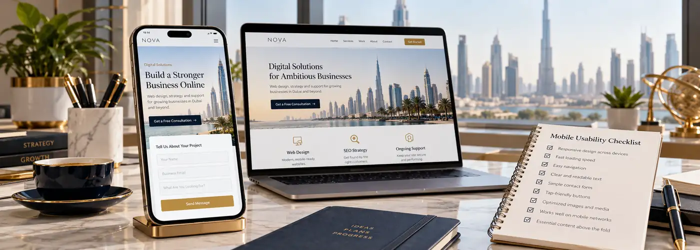
A mobile website review should follow a real task: finding a service, comparing a product or sending an enquiry. A page fitting inside a phone screen is only the beginning. Customers also need readable information, usable controls and a journey that keeps working when the keyboard opens.
This checklist helps business owners assess the experience without treating every problem as a reason for a complete redesign. Start with the pages and actions that matter most.
1. Review the opening screen in context
Can a new visitor identify the business, understand the offer and find a sensible next step? Check headings that wrap onto several lines, large empty spaces and oversized decorative elements. Keep the main action visible without covering useful content.
Test with a real page title and realistic text. A layout that works with a short placeholder may fail when a service name or translated heading is longer. Review different phone widths rather than only one saved screenshot.
2. Make navigation predictable
Open and close the mobile menu, expand service groups and follow a child link. Check that the close control remains visible and that the menu can scroll when its content exceeds the screen. The page behind an open drawer should not unexpectedly move.
Use understandable labels and enough separation between adjacent controls. Do not rely on hover behaviour for essential information. If a sticky header is used, make sure it does not occupy an excessive part of the reading area.
3. Test forms with the keyboard open
- Keep labels visible after a field has a value.
- Use appropriate email and telephone input behaviour.
- Explain required fields and validation errors clearly.
- Preserve entered values when a correctable error occurs.
- Check that the submit button is reachable above or after the keyboard.
- Verify the success state and actual enquiry delivery.
The W3C form-label guidance explains how labels identify controls for different users. A placeholder should not be the only explanation of a field, especially once typing replaces it.
4. Read the content without zooming
Check body text, captions, policy links and card metadata. Small text is often hidden in the details even when the main paragraph looks comfortable. Avoid long unbroken strings that create sideways scrolling.
Look at contrast over photography and tinted panels. If a background changes across the image, a text colour that works in one area may disappear in another. Use a consistent text panel or suitable overlay where needed.
5. Keep important information available on mobile
Do not remove essential service details, product information or internal links solely to make the phone layout shorter. Google’s mobile-first indexing guidance stresses access to important content and resources on the mobile version.
Organise lengthy information with clear sections and accessible expandable controls where appropriate. The content still needs to be available and usable. A condensed layout should reduce clutter rather than remove answers customers need.
6. Check media and fixed elements
Use responsive images with appropriate dimensions and compression. Reserve space for media so text and buttons do not jump as files load. Test galleries with touch gestures and ensure there is an obvious way to return to the page.
Review cookie notices, chat buttons and sticky calls to action together. Individually small widgets can overlap when displayed simultaneously. Confirm that users can dismiss a panel and reach the page’s content and controls.
7. Run one complete journey before signing off
- Arrive on an important landing page.
- Use the menu or search to find the next relevant page.
- Read the details and open any required options.
- Complete the form, contact action or shopping flow.
- Check the confirmation and backend delivery.
Record each issue with the device width, page and action that triggered it. This makes a focused fix easier to verify. Repeat the affected journey after the change.
Frequently asked questions
Is a responsive template enough?
No. Content, widgets, forms and integrations can still introduce mobile problems after the template is configured.
Should mobile pages contain less information?
They can be organised differently, but customers still need the important information required to decide and act.
Do I need to test every phone model?
Use representative widths and browsers, then prioritise devices your audience actually uses. Combine automated checks with real journeys.
Explore responsive business web design and performance optimisation. Read why visitors may not enquire or request a mobile website review.