

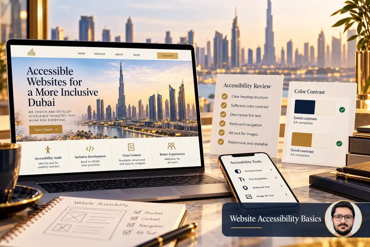
Website accessibility helps more people understand content and complete tasks, including people using keyboards, screen readers, magnification or alternative input methods. Start with the real journeys on your site: navigation, reading, searching and submitting a form.
This guide is an introductory review for business owners. It can help identify issues to fix, but it is not a complete accessibility audit or a statement that a website meets every applicable requirement.
1. Review page structure and meaningful headings
Use headings to describe sections and organise the content logically. Do not choose a heading level only because its default font looks attractive. A consistent structure helps readers understand the page and helps assistive tools expose its organisation.
Give links and buttons understandable names. “View website maintenance services” provides more context than several identical “Click here” links. If an image acts as a link, ensure its accessible name explains the destination or action.
2. Test navigation with a keyboard
Move through the page using the keyboard and try the main menu, forms, accordions and dialogs. Check that focus is visible and follows a sensible order. You should be able to understand where you are without moving a mouse.
- Reach important links and controls.
- Open and close interactive menus.
- Use form fields and select options.
- Dismiss dialogs through an appropriate control.
- Avoid becoming trapped inside a component.
The W3C Easy Checks describe a first accessibility review. Use findings to guide further testing rather than treating a short checklist as proof of full conformance.
3. Give forms labels and useful instructions
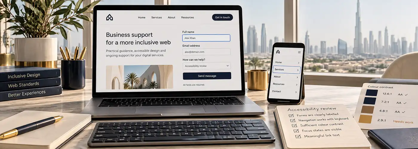
Keep field labels visible and associate them with their controls. Explain required fields and any unusual format before submission. Placeholder text alone is not a reliable substitute for a label because it disappears as the user types.
The W3C forms tutorial explains labels, structure and feedback. Review the website’s actual form implementation as well as its appearance, including telephone widgets and custom dropdowns.
4. Make errors understandable and recoverable
Explain which field needs attention and why. Do not rely on a red border alone to communicate the error. Preserve valid entries where possible and help the visitor return to the affected field.
Test the success and failure states, not only an empty form. Ensure messages remain understandable with a screen reader and do not disappear before a person can act. Verify that visual changes do not push controls outside the phone screen.
5. Check contrast and information carried by colour
Review text against its actual background, including photographs and tinted cards. Small grey text that looks subtle on a large monitor may be difficult to read in ordinary use. Check links, disabled controls and validation messages as well as paragraphs.
Use suitable testing tools and the relevant accessibility criteria for the component. Provide another meaningful cue where colour communicates status, such as a text label accompanying an error or selected option.
6. Review images, motion and responsive layouts
Write alternative text according to an image’s purpose. An informative product image needs a useful description; a purely decorative element should not add unnecessary reading noise. Avoid repeating a nearby caption without considering what information the image contributes.
Check zoom, small screens and content reflow. Important information should not be hidden simply to make the mobile page shorter. Review moving content and controls so users can manage interactions without being rushed or distracted.
7. Combine tools with human task testing
- Run an appropriate automated scan.
- Review the reported issues in context.
- Test essential journeys with the keyboard.
- Check forms, errors and dialogs manually.
- Use further assistive-technology testing where appropriate.
- Record fixes and retest affected components.
Automated tools can identify some problems but cannot judge every meaningful interaction or content decision. Involve suitable expertise when the site’s complexity or obligations require it.
Frequently asked questions
Can an automated score prove a website is accessible?
No. It can support investigation, but manual checks and appropriate expertise remain important.
Does accessibility only help screen-reader users?
No. Readable content, clear labels and predictable controls can help people using many different devices and input methods.
Should I wait for a full redesign to fix issues?
Not necessarily. Focused corrections to labels, contrast or keyboard behaviour can address existing barriers sooner.
Read the mobile experience checklist and explore business web design. Describe the journeys you need reviewed to scope an appropriate improvement project.